
Datasine
Branding | Website
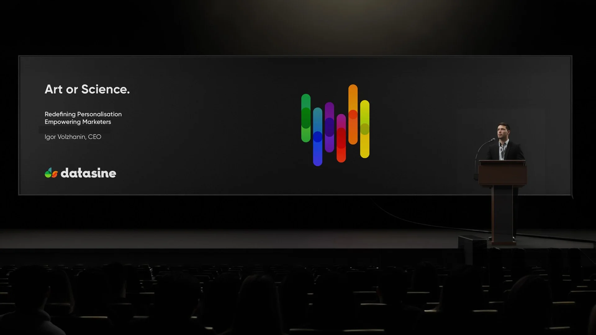
Datasine's business was rapidly expanding with new customers and a growing global market, making it clear the brand needed to evolve. Tasked with redefining Datasine's identity, Heat Design embarked on a journey to create a brand that truly reflected its innovative fusion of AI and psychology.
"Working together with Stephen and his team at Heat Design on our Datasine rebrand has been a real joy, and we couldn’t be more proud of the result – they bring that rare blend of being seasoned pros while equally being great people to work with.
Our brief was ambitious and the timelines tight – what impressed me the most was their ‘we can do it’ attitude paired with clear outlines of the What’s and When’s. They stuck to it.
Where others do a job, you get the feeling Stephen and his team put their heart and soul into every aspect of the project, going above and beyond at any stage. They really became part of our team. We hope there will be future opportunities to work together again."
— Cornel Lazar, Marketing Director


With new customers and an expanding global market, Datasine’s business was growing. It became increasingly evident the brand needed to grow with it.
Fusing AI and psychology, Datasine was a smarter start-up – using data to tailor content to a particular personality. At the forefront of MarTech, Datasine needed a new brand that reflected its innovative identity. Heat was assigned to redefine the brand, rethinking its identity and personality.
Datasine’s initial branding, created by their CEO, was pigeonholed in the tech sector. “Datasine is all about personalising how brands communicate with their audience, and that was missing,” realised Datasine Marketing Director, Cornel Lazar.
A rebrand was more than just a logo change; it required discovering who Datasine had become. By studying the company’s values and conducting brand personality exercises, we defined three key pillars for the brand’s tone of voice: imaginative, straightforward, and bold.
Collaborating closely with Datasine, we crafted a clean, bold, and simple visual identity using Futura and Hurme Geometric Sans. The client loved the distinctive style, which became integral to the brand’s identity.
Cornel Lazar praised our work, highlighting our commitment and the seamless integration of our team with Datasine’s. The rebrand successfully brought Datasine's vision to life, positioning it as a leader in personalized communication.